The Rodan Market Dashboard displays a collection of information on the Ontario Electricity Market in a single, tidy window that is displayed through your web browser. It combines information from many data sources into a single display that is updated automatically as the source data changes:
Customize your Dashboard so it monitors specific market and system information; avoiding the need to search through dozens of data sources to view the data you need. New system messages from the IESO are immediately brought to your attention through the use of colour highlighting, flashing and a computer synthesized voice. You can also preset thresholds so the areas can be quickly distinguished through coloured borders if the values cross through.

Starting the Dashboard for the first time is easy. First-time users always receive a pre-configured Dashboard that includes a popular variety of data sources to demonstrate its capabilities.
Once here, you can customize it through the Dashboard Editor, which is accessed on the [Edit Dashboard] link at the top of the screen. The Dashboard Editor allows you choose different content areas and details, change the screen layout, alter the voice settings or modify the threshold settings.
That's it! By logging on the first time you will already have a basic Dashboard up and running.
The Hourly System Forecast Window combines hourly price, supply and demand forecast data and historical prices and market data in a single window. The data updates automatically to ensure you are have the latest information that could impact your electricity costs and revenues:
The information in the forecast window change hourly with the release of new market prices, or more frequently as new System Status Forecasts or Pre-dispatch data is released. Select [Edit Dashboard] link to choose the items you wish to track and the order they are to appear in the forecast window.

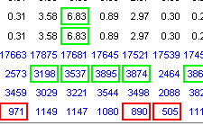
You may select to view 24-hour data for the Current Day or the Day Ahead by clicking on the appropriate link at the top of the forecast table. The data within the forecast will reflect the selected date, and the links at the top of the forecast will direct you to the appropriate report.
Within the 24-hour data table, blue numbers indicate a forecasted value – forward-looking data from the SSR, predispatch or DACP data. Black numbers indicate a historical values for Energy, Operating Reserve dispatch prices or Market Demand.
Each field in the forecast window is compared against thresholds that you set for each item using the Dashboard Editor. Anytime a value drops below the item's Lower Threshold the item will be bordered in red , while anytime a value exceeds the item's Upper Threshold it will be bordered in green .
The Alarm Console alerts you of all new system messages posted by the IESO in the System Status Report. This includes System Status Advisories for normal and emergency conditions, significant changes to forecasts and outages to major circuits in Ontario and its interties. While the IESO SSR report is re-published five to ten times daily and Dashboard identifying those messages that are new is extremely difficult. The Alarm Console tracks the content of each report and detects what information has changed so it can be quickly brought to the attention of the user.

New messages received by the Alarm Console are highlighted, flash and can be accompanied by a voice message to ensure they are not inadvertently missed. New messages must be acknowledged by clicking on the ACK link beside the message, which will stop the flashing and silence the voice.
The Alarm Console includes features that ensure operators, traders and energy managers are kept aware of changing system conditions without delay:
You can modify the layout and contents of your Dashboard so it will track the information you need in the way you need to see it. Do this by selecting a 2-Column or 3-Column Layout, and by adding one to eight content areas into the Hotspot areas within, as shown below.

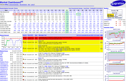
Once you have selected 2-Column or 3-Column Layout, you may choose the content areas and their locations within the Dashboard. Later, you can further customize your Dashboard by selecting the content that you wish to include in each selected area, and set alarm thresholds.
Market prices are updated every 5-Minutes automatically, shortly after being generated and published by the IESO. This occurs several minutes after the dispatch interval. These represent the 5-Minute unconstrained uniform prices for Energy and the three classes of Operating Reserve (OR) within Ontario, as well as the Energy and two classes of OR at the interties with other provinces and states.
A 10-Minute Spinning Operating Reserve prices are only valid for the Ontario Zone (ONZN), and is not generated for any interties.
Anytime a Market Price exceeds a threshold that you have set in the Dashboard Editor it will change color and is bordered in green .
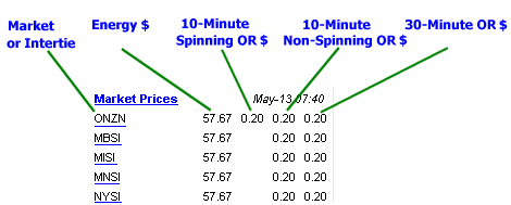
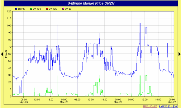
Clicking on any Zone or System Intertie will show a chart of the 5-Minute Energy and Operating Reserve prices for that Zone for the last 2 days. From that chart, you may select the left or right arrows to scroll back to a maximum of two weeks.

The Market Demand in Ontario represents the total Constrained Load + Exports + Losses. The chart shows three lines representing the Predispatch (hourly), Dispatch (5-min) and Monthly Peak (hourly) Demands. Two days of information is always displayed and includes the current day and either previous or next day, depending if the next day's predispatch data is available. Clicking on the chart will launch a larger version in a separate window.
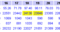
You can configure the Dashboard to show hours when the Predispatch hourly demand approaches or exceeds the current monthly peak demand – you set the tolerance in either absolute MW or as a percentage. A Console alert will also be displayed and spoken if new hours are detected for the first time.
Industrial and Commercial Loads in Ontario pay a monthly Transmission Demand Charge based on their peak monthly hourly consumption (MW). This charge increases when their peak MW coincides with the system-wide peak for all Loads in the province. Such companies can save significantly by monitoring for new system-wide peaks and reducing their consumption during that time. While the Ontario Load by itself is not published by the IESO, the Market Demand (which includes Losses + Exports) is available.

The Dashboard can track the 5-minute Ontario Demand forecast against the actual demand. This module provides a real-time graph on your main screen showing the variance between actual and forecast demand. It can also generate alert messages whenever that variance exceeds a user's threshold setting. The 5-minute forecast is an estimate that is generated by the Market Dashboard server by comparing the IESO hourly Pre-Dispatch against earlier days actual 5-minute demands. It then applies weights to these historical values, based on a number of factors, in order to create a composite detailed forecast.

This feature is particularly useful to Class A consumers as they are charged Global Adjustment based on their consumption that is coincident with the top 5 peak periods. We expect to see significant shifts in Ontario Demand as a portion of this group, representing 2000 MW in total, withdraws their load for these top hours. This module will help these Dashboard customers identify if the demand is shifting higher or lower – potentially resulting in a peak moving to another hour – so they can adjust their own curtailment actions.
Shadow Prices are generated and published by the IESO Dispatch Schedule and Optimization (DSO) process for most nodes in Ontario. These represent the constrained marginal price of electricity at a node, and take into consideration transmission limits, transmission losses, resource physical capabilities, and penalties that the DSO imposes when it is forced to relax its criteria in order to achieve a solution.
While Shadow Price data is generated by the IESO on a 5-Minute resolution, it is published on an hourly basis. The Dashboard will show the latest 5-Minute price, using the last interval of the previous hour.

These prices are useful in determining how a dispatchable resource will be dispatched based on the bids and offers it has provided at a specific location. When a shadow price exceeds a bid price submitted by a resource, that resource will be dispatched up if it is a generator, or down if it is a load.
Anytime a Shadow Price exceeds a threshold that you have set in the Dashboard Editor it will change color and is bordered in green on the Dashboard.
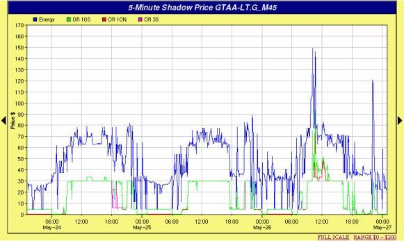
Clicking on any Shadow Price will show a chart of the 5-Minute Energy and Operating Reserve prices for that Delivery Point for the last 2 days. From that chart, you may select the left or right arrows to scroll back to a maximum of two weeks.
The Dashboard can generate a special alert in its Alarm Console whenever the 5-Minute Market Price in Ontario exceeds the threshold you have set in the Dashboard Editor. Dashboard The alert can be based on the price for Energy, and/or any of the three Operating Reserve classes and can be accompanied by a voice message if you have sound enabled.

An alert will be generated once the price(s) equal or exceed any threshold (Energy or OR). It will not be re-armed until the price drops back below all thresholds (Energy and OR).

The Supply Mix Graph can be added to your Dashboard to show the demand on each fuel type currently supplying energy in the Ontario Market. The graph shows the energy output (from bottom to top) of all Nuclear, Hydro, Wind, Coal, Gas and Gas/Oil.
By clicking on the small graph, a larger Report launches to show Generation Supply, Market Demand, Interchange Transactions and Market Price graphs on one screen. Information to the right and bottom of the graphs give additional detail for any selected hour. By moving the cursor over the chart and clicking on the desired hour, the data for that hour will automatically update.

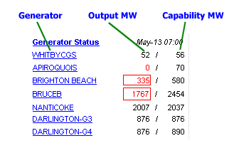
Any dispatchable generator in Ontario with a rated capability of 20MW or more can be tracked in the Generator Status area. This will show the most recent Output (MW) and Capability (MW) of the unit, as reported by the IESO, which delays the data by one hour.
Anytime a Generator exceeds the upper threshold that you have set in the Dashboard Editor, the output or capability (or both) will change color and be bordered in green on the Dashboard. If it drops below the lower threshold it will change color and be bordered in red .
Clicking on any Generator Name will launch a new window that brings you to the Market Dashboard Generator Performance page for that unit, which shows more details and a large graph of the unit's recent output and capability. From there, you can also view historical performance and financial data on the generator.
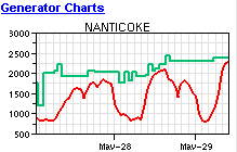
Use the Dashboard Editor to add charts that show the last 2-days of output and capability for any Ontario generator over 20MW, delayed by one hour. You may select to chart an individual generating unit, where available, or an aggregate summed to the station level.
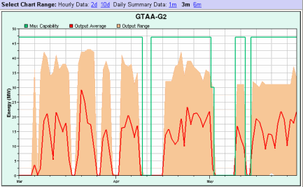
Clicking on any Generator Chart will launch a new window that brings you to the Market Dashboard Generator Performance page for that unit. That page shows more details and a large graph of the unit's recent output and capability. From there, you can also view further detailed data back 10 days as well as historical data summarized back to 6 months. You may also view collected performance and financial data on the generator and all generators owned by the company.
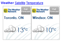
Current and forecast weather is provided by The Weather Network and available for most towns and cities in Ontario. Use the Dashboard Editor to select the towns you wish to add to your Dashboard Weather window. Clicking on any forecast will bring you directly to The Weather Network and more details on the current weather for your chosen town or other municipalities.
Rodan Energy greatly appreciates The Weather Network for providing this service.
The Commodity Prices window can be added to your Dashboard so you can monitor their futures prices from the New York Mercantile Exchange (NYMEX). Arrows and a delta price indicate if the value of the commodity has changed up or down since the previous day. Prices are delayed 20 minutes.

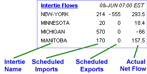
The power flows between Ontario and its neighbours can be monitored using the Dashboard. The previous hours' scheduled Imports and Exports as well as the Actual net flows are show for the 13 major Ontario Interties. A negative (-ve) number indicates an Export or net Export (i.e. the amount of exports exceeds the amount of imports).
It is normal to have a large discrepancy between the scheduled flows and actual flows for both New York and Michigan interties. This is a result of Lake Erie Loop Flow beyond the System Operators' control, however, the aggregate scheduled and actual flows of these two interfaces are usually very close.
Information is shown on the lower right of your Dashboard indicates the status of your Dashboard and its communications with the Market Dashboard server.
The Dashboard status will normally be a green OK, or a blue READ when the Dashboard is communicating with the server. If there is a problem with the communications or user session, a message will appear in this window and/or the Alarm Console. Other than cases where the login session has been terminated (i.e. account expired or the user has logged in from another terminal), the Dashboard will continue trying to communicate with the server and will resume normal operation after the communications problem is fixed.

The fields in the Forecast Window are one of the more complex information areas in the Market Dashboard and warrant further explanation below. The data in this window can be either Pre-Dispatch data, Forecast data, or Historical Real-Time data. In some cases, the same line will be used to show both historical and pre-dispatch data using different font colours: Blue for Forecast/Predispatch, and Black for Historical/Realtime.

You may select the day to monitor by clicking on the appropriate link at the top, Current Day, Day Ahead, or Day 2.